The Trends tab provides a clear view of how your project is evolving over time. By exploring the key trends available, you can identify patterns, spot areas of progress or concern, and gain insights into overall project performance. Each trend highlights specific aspects of your data, helping you make informed decisions, anticipate potential issues, and communicate progress effectively with your team.
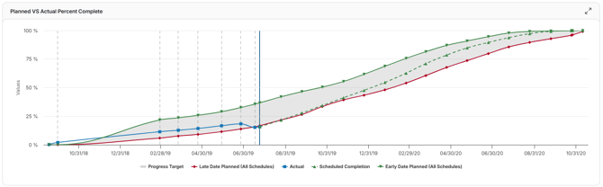
Planned vs. Actual Percent Complete
This trend compares your project’s baseline planned progress (what was supposed to be completed) against actual progress achieved across schedule updates. It shows where your team is ahead, on track, or lagging behind relative to the original plan.
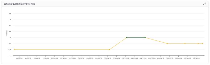
Schedule Quality
This trend tracks how the quality of your project schedule evolves across updates. It reflects adherence to best practices, such as minimizing high float activities, reducing constraints, and maintaining a balanced critical path.
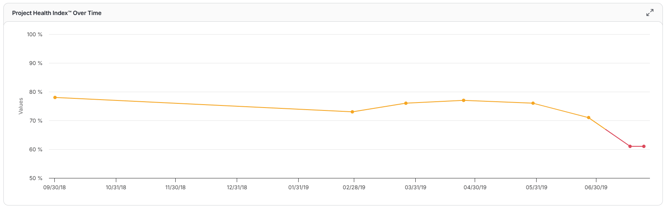
Project Health Index
The Project Health Index™ provides a single, high-level score that reflects the overall performance of a project. This trend shows how Project Health has been reflected over each update.
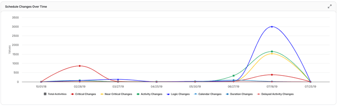
Schedule Changes
This trend visualizes the frequency and types of schedule changes, such as activity additions, logic modifications, or duration adjustments, over the course of a project.
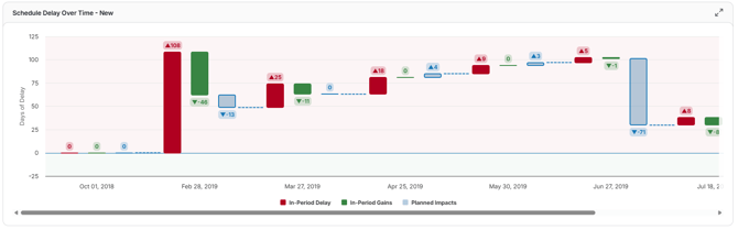
Schedule Delay
This trend visualizes how critical path delays & gains, planned change efforts, and overall end date variances evolve across schedule updates. It helps project managers assess whether delays are accumulating, if recovery strategies are effective, and whether the project is on track to meet its original completion date.
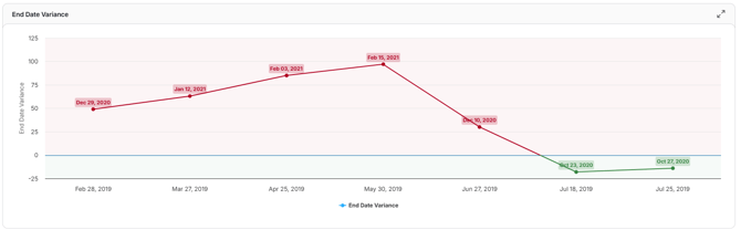
End Date Variance
This trend tracks how the difference between the planned project completion date and the current projected completion date changes across schedule updates.
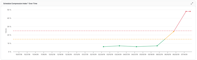
Schedule Compression Over Time
This trend tracks the amount of effort required to complete the remaining work on a project compared to the same amount of final work remaining in the baseline schedule.
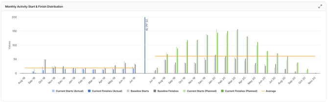
Monthly Activity Start and Finish Distribution
Shows the number of activities starting and finishing in each month across the project timeline. This trend helps project managers understand work pacing, seasonal workload, and whether activities are concentrated or spread out over time.
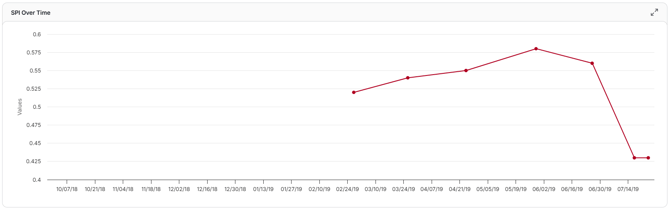
SPI Over Time
Tracks the Schedule Performance Index (SPI), a measure of schedule efficiency, across updates. An SPI of 1.0 means the project is on schedule; below 1.0 indicates delays, while above 1.0 shows progress is ahead of plan.
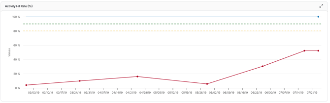
Activity Hit Rate
Displays the percentage of activities that started or finished on time compared to their planned dates. It helps assess team reliability and the accuracy of schedule predictions over time.
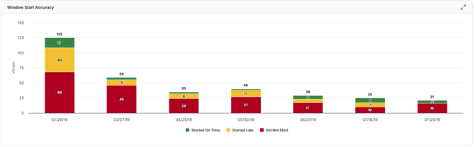
Window Start Accuracy
Measures how closely activities start within their scheduled “window” over successive updates. Higher accuracy indicates the team is consistently initiating work as planned, while lower accuracy flags early or late starts.
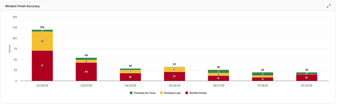
Window Finish Accuracy
Tracks how closely activities finish within their scheduled “window” over time. Maintaining high accuracy ensures completion dates align with the planned schedule and reduces risk to the project end date.
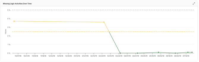
Missing Logic
This trend shows how many activities lack proper dependencies. Because missing logic is a major risk for schedule accuracy, this chart helps you monitor it over time and aim to minimize it for better schedule integrity.
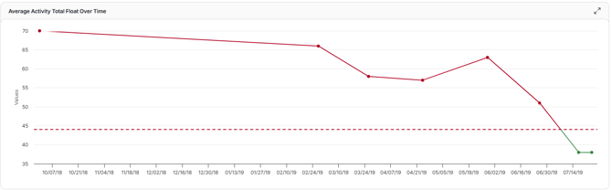
Average Activity Total Float
This trend tracks how the average total float (slack) across all activities changes over successive schedule updates.
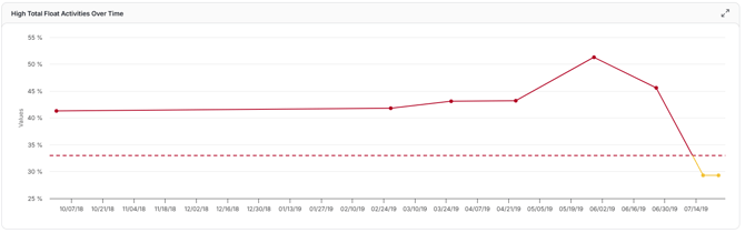
High Total Float Percentage
This trend measures what percentage of activities in your schedule carry high float over successive updates. A rising or high value may point to overly loose logic or weak schedule structure, while a declining trend suggests your schedule is tightening constraints and getting more responsive.
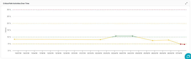
Critical Path Percentage
This trend shows how the percentage of activities on the critical path changes across schedule updates. It helps you understand whether your schedule is becoming more constrained (lots of critical tasks) or more flexible (fewer critical tasks).