Custom Dashboards allows you to create multiple custom dashboards within your SmartPM projects. This gives you the flexibility to build tailored views for different teams, project phases, or analysis needs within a single project.
As an Admin, with Manage Dashboards, you can:
- Create unlimited custom dashboards for each project
- Add filters at both the dashboard level and individual section level
- Customize layouts with sections, charts, tables, and info blocks
- Set dashboards as company defaults
- Control access with public/private settings and user assignments
- Build reusable templates for consistent reporting across projects
- Select project data to populate your dashboard with live metrics
The Manage Dashboards feature is available to all users. To access, click Dashboards from the Global Navigation Menu.
To create a new dashboard:
Step 1: Add Sections and Content
Click "Add Section" to begin building your dashboard layout.
- Chart: Add any SmartPM chart (avg hit rate, avg compression, etc..)
- Table: Add tabular data views (full-width only for tables)
- Custom Column Layout: Choose between single-panel-to-column layouts
- Metric Group: Add the metrics on that are located at the top of dashboard: Total Projects, Average Health
- Metadata: Add the tables that are grouped by metadata
Step 2: Select Your Project Data
To add Project Info, click Add Project Info, then click Select Projects from the right-hand side. From here, you can add any info, chart, or table available at the project level. Then choose which projects to include using one of the following options:
- Hand-picked projects: Keep it focused. Manually select only the individual projects you want to see here.
- Smart Filtered Projects: Group by what matters to your business (like region or team). As projects change, this dashboard adapts automatically.
- Every project: See the big picture. Automatically include every project you have, now and in the future.
Step 3: Name Your Dashboard
Give your dashboard a clear, descriptive name that indicates its purpose.
- Be specific: "Critical Path Activities - Q1 Review" instead of "Dashboard 1"
- Include the filter or focus: "Site Progress Dashboard" or "Electrical Trade Performance"
- Use consistent naming conventions across your company for easier navigation
- Consider the audience: "Executive Summary" vs. "Scheduler Deep Dive"
Step 4: Customize Each Section
For each section you add, you can:
- Rename the section for clarity
- Apply section-specific filters (see Filtering Options below)
- Adjust column width (split or single-panel)
- Reorder sections by dragging and dropping
Step 5: Save Your Dashboard
Click "Save Dashboard" to finalize your custom dashboard.
How to Filter Project Dashboards
One of the most powerful features of custom dashboards is the ability to filter. It's important to note that filtering isn't a separate step you do after building out your sections or project info; it happens at the section (or "editing") level. To filter, you need to be inside the section itself; there's no single filter that applies to the whole page. Each metric has its own independent filter.
How to add a section-level filter:
- Click Dashboards from the Reporting Menu
- Click the edit icon from the right of the dashboard you want to edit
- Click Filter at the top of the page
- Select your filter criteria (e.g., "Near Critical Activities") and click Add
- This filter only applies to this section
Use Case: Display "Planned vs. Actual Complete" for all activities in one chart, and "Planned vs. Actual Complete - Critical Path Only" in the chart right next to it for comparison.
Naming Filtered Sections
When you add a section-level filter, rename the section to clearly indicate what filter is applied. This prevents confusion when viewing the dashboard later.
Example:
- Default Name: "Planned vs. Actual Complete"
- Filtered Name: "Planned vs. Actual Complete - Critical Path Only"
Without descriptive names, users won't know which chart is filtered and which isn't, especially if you have the same chart type displayed multiple times with different filters.
Private vs. Public Dashboards
Private Dashboards
- Only visible to the user who created it
- Cannot be set as a company default
- Ideal for personal analysis or work-in-progress layouts
Public Dashboards (Company Admins Only)
- Visible to all users in your company (or specific assigned users)
- Can be set as a company default
- Ideal for standardized reporting and team collaboration
How to Change Dashboard Access Levels:
- Go to Dashboards (from the Reporting tab)
- Find your dashboard in the list
- Click on the "Private" or "Public" label in the Access column
- Toggle between Private and Public
If you want to make a dashboard available to specific users (not everyone in the company), you can assign individual users.
Requirements:
- The dashboard must be set to Public (you cannot assign users to a Private dashboard)
- You must be a Company Admin to assign users
How to Assign Users to Custom Dashboards (Company Admins Only):
- Go to Reporting > Dashboards
- Find the dashboard you want to share
- Click on the number in the "Assigned Users" column (e.g., "0")
- Select the users you want to give access to this dashboard
- Click Save
The company default dashboard is the dashboard that all users see when they first open the Dashboard tab in any project.
How to Set a Company Default Custom Dashboard:
- Go to the Reporting Tab
- Click Dashboards at the top
- Find the dashboard you want to set as the default
- Click the checkbox in the "Company Default" column
- Only one dashboard can be set as the company default at a time
The company default dashboard must be Public (it cannot be Private). Once a dashboard is set as the company default, it cannot be made Private. If you set a new dashboard as the default, the previous default will be unselected automatically.
Understanding the Default Project Dashboard Tab:
The classic Project Dashboard Tab is a centralized overview that provides access to all project analytics and performance insights. Within the dashboard tab, there are several metrics available for analysis.
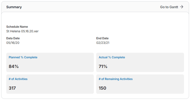
Summary
A snapshot of your project’s key details, including links to the Gantt chart, schedule name, data date, finish date, planned vs. actual progress, and activity counts, so you can quickly see overall status and remaining workload at a glance.
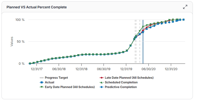
Planned VS Actual Percent Complete
A visual comparison of planned vs. actual progress over time, including early and late projections. The chart also forecasts future performance beyond the data date using historical production rates to show where your project is headed.
(Displays: Progress Target, Early/Late Planned Dates, Actual Progress, Scheduled Completion, Predictive Completion)
Average Trend Lines
The chart includes two average trend lines:
- Left of the Data Date: Represents the average of past data, up to the current data date.
- Right of the Data Date: Represents the average of future data, from the current data date onward.
To calculate these averages:
- Sum all metric bar values for the respective side of the data date.
- Count the number of months represented.
- Divide the total sum by the number of months to obtain the average.
Example:
If the sum of metric values to the right of the data date is 188, and there are 6 months:
188 ÷ 6 = 31.33
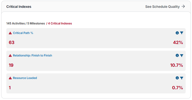
Critical Indexes
A snapshot of your schedule’s overall health, showing counts and percentages of key quality indicators. Quickly identify high-risk logic issues, like missing ties, negative lags, or finish-to-finish relationships, that could affect accuracy and reliability.
(Displays: # of Activities, # of Milestones, Critical Indexes such as Finish-to-Finish, Missing Logic, and Negative Lag)
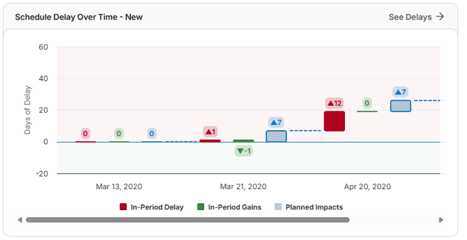
Schedule Delay Over Time - New
See how your project changes day by day, including delays, gains, compression, and adjustments affecting the critical path, so you can understand what’s driving schedule performance.
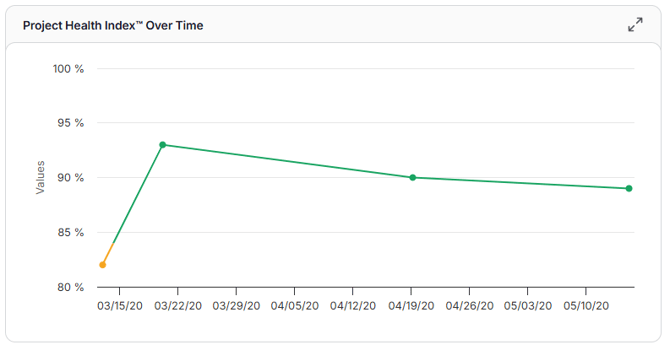
Project Health Index Over Time
Tracks your overall project risk over time using the Schedule Quality Grade™, SPI, and Schedule Compression Index™. Quickly see whether risk is rising, falling, or staying stable.
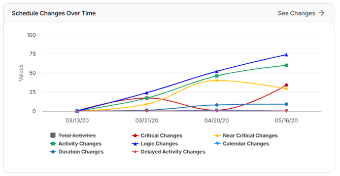
Schedule Changes Over Time
A concise view of all recent schedule updates, including activity, logic, calendar, duration, and delay changes, plus counts of critical and near-critical changes. Easily drill down to see more details when needed.
(Displays: Total Activities, Critical Changes, Near-Critical Changes, Activity Changes, Logic Changes, Calendar Changes, Duration Changes, Delayed Activity Changes)
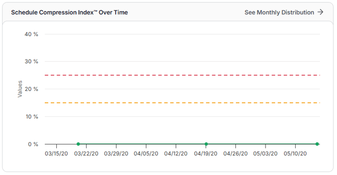
Schedule Compression Index Over Time
Shows how the Schedule Compression Index™ changes over time from delays, schedule updates, or missed progress. Highlights how much daily effort is increasing to stay on track, with the option to explore more in the Monthly Activity Start & Finish Distribution Table.
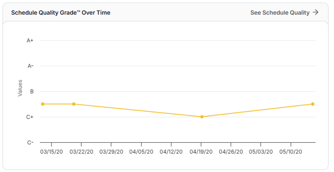
Schedule Quality Grade Over Time
Displays the Schedule Quality Grade™ over time, helping you see if your schedule’s structure is staying strong or starting to break down. Click through for more details in the full Schedule Quality Report.
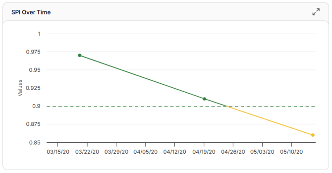
SPI Over Time
Tracks the Schedule Performance Index (SPI) over time, showing whether your project is ahead, behind, or on track.
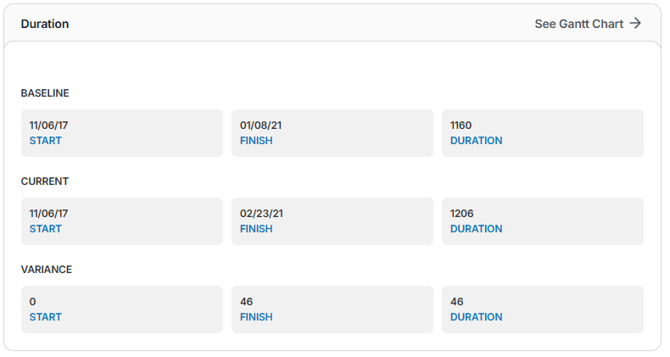
Duration
Shows baseline and current start/finish dates and durations, along with variances, so you can quickly spot slippage or compression. Acts as an early warning for potential schedule risk, even from small changes.
(Displays: Baseline – start, finish, duration; Current – start, finish, duration; Variance – start, finish, duration; option to see Gantt)
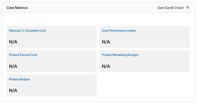
Cost Metrics
Provides a snapshot of your project’s budget performance, including planned costs, earned value, remaining budget, total budget, and the Cost Performance Index (CPI). Quickly see if the project is on track, overspending, or underperforming in cost efficiency.
(Displays: Planned % Complete Cost, Cost Performance Index, Project Earned Cost, Project Remaining Budget, Project Budget; option to see Gantt)
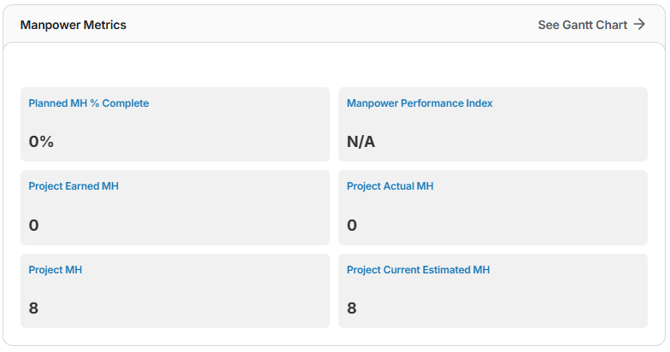
Manpower Metrics
Tracks labor productivity and resource efficiency, showing planned progress, earned and actual man-hours, total planned hours, current estimates, and the Manpower Performance Index (MPI). Helps support workforce planning and resource leveling.
(Displays: Planned MH % Complete, MPI, Project Earned MH, Project Actual MH, Total Planned MH, Current Estimated MH; option to see Gantt)
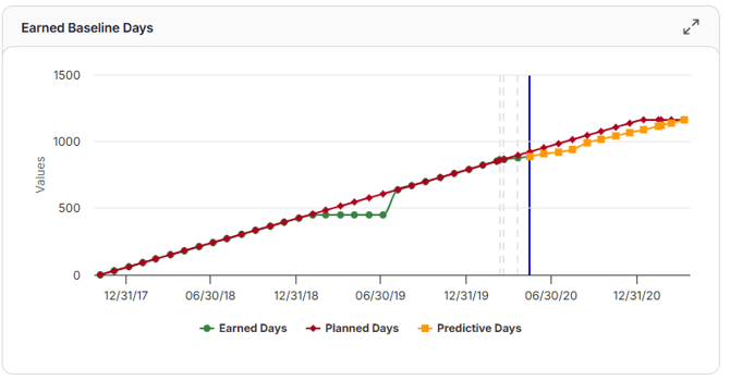
Earned Baseline Days
Shows how your project’s progress compares to the baseline and planned schedule. Earned Days represent the number of baseline days it would have taken to achieve the actual progress completed, alongside Planned Days and Predictive Days for forecasting.
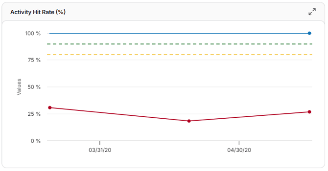
Activity Hit Rate
Displays the trend of activities starting and finishing on time, based on the latest update and progress targets, helping you track schedule reliability and on-time performance.
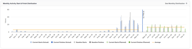
Monthly Activity Start & Finish Distribution
Compares baseline vs. current activity starts and finishes each month, overlaid with actuals. Click any value to see the specific activities, dates, variances, and related change log details.
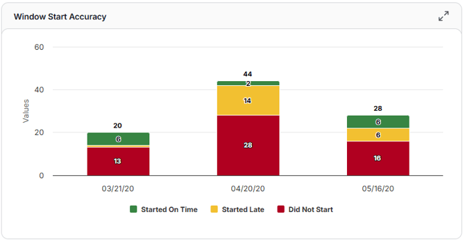
Window Start Accuracy
A stacked bar chart showing activities that started on time, started late, or didn’t start. Quickly see how accurately work began compared to the most recent update’s plan.
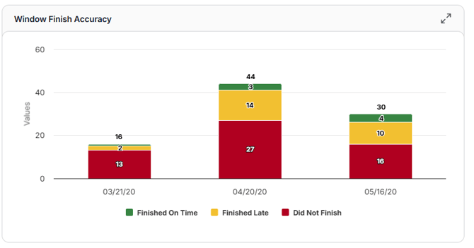
Window Finish Accuracy
A stacked bar chart showing activities that finished on time, finished late, or didn’t finish. Easily track how closely actual completions matched the most recent update’s plan.
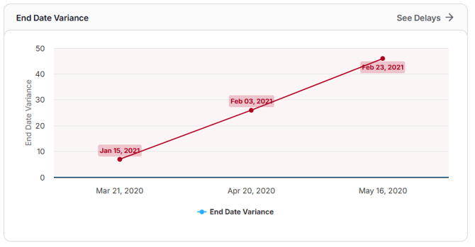
End Date Variance
A line or bar graph showing how current finish dates compare to baseline or contractual dates for each update period. Quickly see if schedule slippage is growing, stabilizing, or improving over time.