This video will review the SmartPM Delay Tables and how to get information and reporting from it.
Navigate to the Delay Table:
- From the Company Dashboard, click on the Project Name
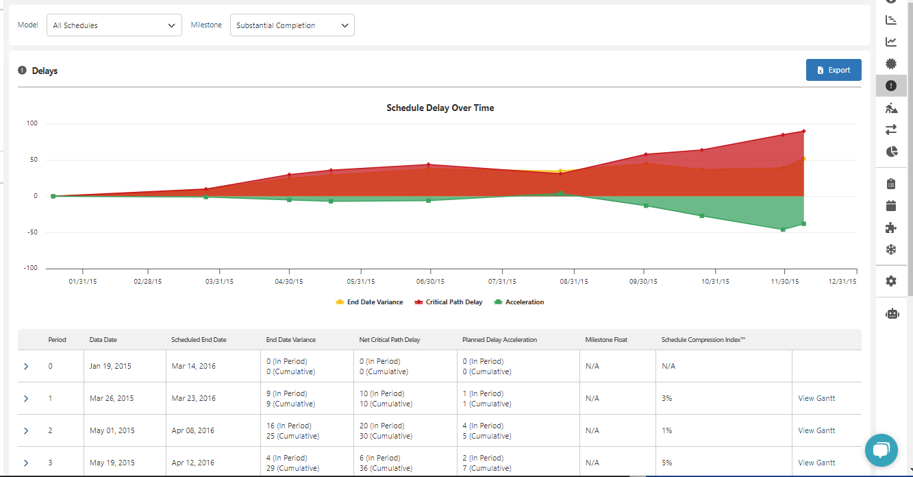
- From the Project Workspace page click on the “!” icon on the right which says “Delays” when you hover over it. You will see the Schedule Delay Over Time Graph and the Delay Table underneath.

Review the Delay Table:
Note: all days in the Delay Table are calculated by using calendar days, not a work week.
Periods:
Each update represents a time period. The baseline schedule will be period zero.
Data Dates:
You will see the data dates for each schedule update. Those data dates are setting the time windows for the delay calculations.
End Dates:
The End Date column shows the projected end date of each schedule.
End Date Variance:
SmartPM shows the end date variance both period by period, and as a cumulative total from the Baseline Schedule. This is calculated by subtracting the Planned Delay Acceleration from the Net Critical Path Delay.
Net Critical Path Delay:
SmartPM shows the Net Critical Path Delay both period by period, and as a cumulative total from the Baseline Schedule.
Planned Delay Acceleration:
SmartPM shows the Planned Delay Acceleration both period by period, and as a cumulative total from the Baseline Schedule. Planned Delay Acceleration is created adjusting logic and adjusting activities to the remaining plan to bring in the end date
Schedule Compression Index:
The Schedule Compression Index is an indication of the feasibility of the schedule. Compression over 40% becomes unfeasible unless major changes are made, like adding more crews.
To see the details of what caused delay and acceleration for a specific Period:
Click on the down arrow on the right hand side of the Period in the Delay Table - This will uncover what activities caused delay in the period and what activities recover delay. You can see what actually occurred, and whether it caused delay to the critical path, or whether there was better than planned progress achieved on the critical path.
To see the Gantt Chart view for a specific Period:
Click on “View Gantt” on the right hand side of the Period in the Delay Table. You will see the Gantt Chart view of activities that have caused delay or acceleration.
Export the Delay Table:
Click the blue Export button in the top right - SmartPM will export an Excel file which will contain all of the values in the Delay Table.
Delay Table in the SmartPM Report:
The delay Table is included in the SmartPM Report which can be printed, saved or exported. The SmartPM Report can be found in the following places:
- Project Workspace page by scrolling down and clicking on the Reports card by clicking on SmartPM Report
- Reports Page by clicking on the Reports pie chart icon on the Project Workspace page and clicking on SmartPM Report
- Company Dashboard by clicking on the SmartPM Report
