The Executive Dashboard in SmartPM gives you a high-level view of the health, performance, and scheduling of your projects. It aggregates data across your portfolio, visualizes key metrics, and allows for flexible layout.
To access the Executive Dashboard, click the world icon on the far right of your SmartPM window. When you first access the Executive Dashboard, SmartPM will prompt you with two questions to help customize your experience. First, you will be asked what your role is. The available roles are:
- Corporate Executive
- Project Executive
- Schedule Manager
- Operations manager
- Site Team: Scheduler
- Site Team: Non-Scheduler
- Consultant: Scheduler
- Consultant: Portfolio Manager
Once your role is selected, you will then be asked how you want to group your data- whether by region, scheduler, sector, project type, or district manager. You can select as many as you’d like. Then, click save.
If you need to change your role, click the Customize button at the top right of the screen and click the red Reset button.
Key Features of the Executive Dashboard:
- Displays a series of cards with metrics such as project counts, schedule quality, SPI, project health.
- Supports multiple views/layouts depending on role or preference.
- Cards can be customized: shown/hidden, reordered, and resized to suit individual needs.
- Filters or metadata cards allow narrowing down projects based on various attributes.
Reading Month-by-Month and Period Trends
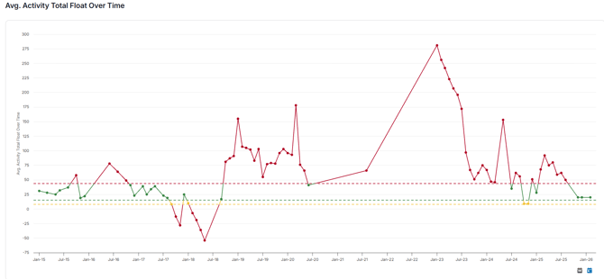
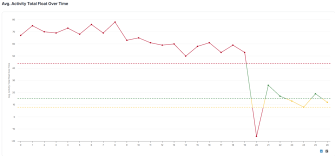
The Executive Dashboard's trend cards show how your portfolio's key metrics, such as SPI, Schedule Quality Grade, and compression, move over time. A period refers to the interval between two consecutive schedule updates (ideally weekly, but follows whatever update frequency is set for the projects in view).
Period trends are most useful when:
- You're tracking whether a consistent group of projects is improving, holding steady, or declining over several updates.
- You want to catch drift early: a downward SPI or rising compression trend across two or more periods is a stronger signal than any single month.
- You're comparing performance across a grouping (region, sector, scheduler) rather than looking at the portfolio as one number.
By Month:
 \
\
By Period:
Applying Filters to Reduce Misalignment
Trends can misrepresent what's actually happening if the underlying project mix shifts from period to period. Before reading a trend, apply filters to keep the comparison consistent:
- Percent complete: Exclude projects below 10% or above 90% complete. Early-stage projects haven't generated meaningful schedule data yet, and teams often stop updating past 90%, which can flatten or distort a trend that isn't really flat.
- Project status: Exclude closed or inactive projects unless you're intentionally reviewing historical performance.
- Schedule quality: Consider filtering out projects with a low Schedule Quality Grade when reviewing performance metrics like SPI or delay. A low-quality schedule often means the critical path itself is unreliable, so performance numbers built on it can be misleading.
- Project grouping: Use the same region, sector, or scheduler grouping across the periods you're comparing, so you're not accidentally comparing different populations of projects month to month.
When the Data May Not Tell an Accurate Story
A few situations can make a trend look worse (or better) than what's actually happening on the ground:
- Adding a large batch of new projects. New projects typically start with lower quality scores or less mature data until they've had a few updates. Adding several at once can pull a portfolio-wide average down even though existing projects haven't changed.
- Mixing project types or sizes. A trend line that blends small, fast-moving projects with large, long-duration ones can obscure what's really happening in either group.
- Projects nearing completion. Teams often slow or stop updates in the closeout phase. A dip in update frequency near completion can make a project look stalled or can skew a trend even though it's simply wrapping up.
- Inconsistent update frequency across the group. If some projects in a view update weekly and others update monthly or sporadically, the portfolio trend can reflect reporting gaps rather than actual performance changes.
- Low schedule quality driving performance metrics. If a schedule has missing logic or excess constraints, its SPI or delay numbers may not reflect reality, and including it in a broader trend can pull the whole view off course.
Using Metadata to Improve Accuracy
Metadata fields let you narrow a view to an apples-to-apples comparison instead of relying on the full portfolio:
- Filter by metadata tags (region, sector, project type, district manager, etc.) to isolate a consistent group before reviewing a trend.
- Use metadata to exclude known outliers, like a single problem project skewing a small group's average, without removing it from the portfolio entirely.
- Combine metadata filters with the percent-complete and quality filters above for the clearest read on a trend.
Setting Up and Customizing the Dashboard
After the initial set up, if you’d like to customize your Executive Dashboard, click the customize button on the top of the screen. From there, you can:
- Hide cards from the dashboard by clicking the eye on the card you would like to hide. You can unhide it by scrolling to the bottom of the board and clicking the eye icon.
- Move the placement of the cards by clicking and dragging the right bottom corner icon.
- Resize the cards using the arrows on either side of the card