Within the Analysis tab, you are able to view in depth analytics for your project.
|
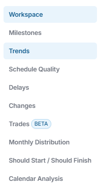
Workspace |
Track your milestones and see project metrics at a glance. |
|
Milestones |
A focused view of key project milestones, their statuses, and potential schedule impacts. |
|
Trends |
Highlights schedule delays, their causes, and their impact on overall project performance. |
|
Schedule Quality Grade |
See issues with schedule quality, how they impact the schedule, and exactly how to fix it. |
|
Delays |
Highlights schedule delays, their causes, and their impact on overall project performance. |
|
Changes |
Tracks and analyzes modifications to the project schedule and their effects on progress. |
|
Trades |
Trade-specific performance, delays, and schedule contributions across the project. |
|
Monthly Distribution |
Visualizes the allocation of work, resources, or costs across each month of the project timeline. |
|
Should Start/Should Finish |
Analyzes planned versus actual start and finish dates for any update. |
|
Calendar Analysis |
Examines project timelines and work patterns to identify scheduling conflicts and optimize resource allocation. |
For information on the Workspace Tab, click here.
For information on the Milestone Tab, click here.
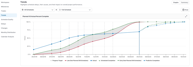
Trends Tab
The View Trends section in the Analysis Tab opens a dynamic report showing how key project metrics evolve over time. It is a visual way to monitor progress, risks, and schedule health across schedule updates.
For more information on the Trends Tab, click here.
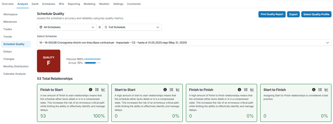
Schedule Quality Tab
The Schedule Quality Analysis provides a detailed view of your project’s schedule health, helping you understand what drives your schedule’s performance and where improvements can be made.
Viewing Schedule Quality Metrics
At the top of the page, you’ll see key metrics specific to the selected project, including the overall Schedule Quality Grade. These metrics provide a snapshot of how well the schedule meets SmartPM’s quality standards.
You can filter the view based on any uploaded schedule for that project.
Understanding Metric Details
Scrolling down the page reveals the metrics that influenced your filtered Model or Milestone. For each metric, you can see:
- Whether its impact on the overall score was positive or negative.
- How your activities, milestones, and critical path indexes contributed to the metric.
- Track how each quality metric changes across updates to track consistency and improvement over time
- Explore a filtered Gantt view for each quality metric to see exactly which activities are affected—where they appear in the schedule, their predecessors and successors, and how they connect within the project.
This level of detail allows project teams to pinpoint specific issues, understand their effects on schedule health, and take action to improve future updates.
Schedule Quality Analysis gives you a clear, data-driven view of your project schedule’s strengths and weaknesses. By filtering by model, milestone, or previous uploads, and reviewing the metrics in detail, you can monitor schedule quality, identify risks, and ensure your projects stay on track.
Delay Tab
Delay Analysis provides a clear, visual representation of schedule delays and accelerations over time. It helps project teams understand when delays occurred, what caused them, and how they impacted the project’s end date and critical path.
When you click Delays, the page will load with a waterfall chart and table summarizing delay performance across all schedule updates.
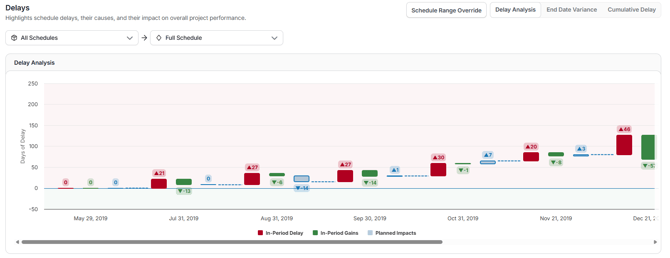
Use the dropdowns at the top of the page to filter by All Schedules or specific versions and Full Schedule or a selected project milestone. The chart automatically updates based on your selection.
You can also click the Export button in the bottom-right corner to download the chart data for reporting or presentations.
Delay Analysis Views:
At the top of the page, you can toggle between several views to analyze schedule movement in different ways:
- Delay Analysis (Default) - Displays in period delays, gains, and planned impacts as a waterfall chart. This view highlights when schedule shifts occurred and whether they were performance-driven or planned.
- End Date Variance – Shows how the project’s forecasted completion date changed across each update. Use this view to track overall slippage or recovery trends.
- Cumulative Delay – Displays total critical path delays and accelerations accumulated over the life of the project, providing a long-term view of delay buildup and recovery.
Below the chart, you’ll find a detailed Delay Table, which lists schedule performance by update period.
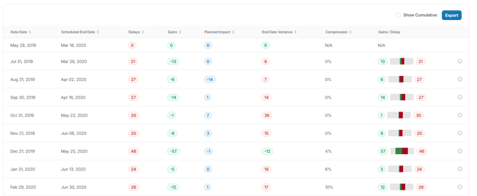
Each row represents one schedule update, showing how that update impacted project timing:
|
Column |
Description |
|
Data Date |
The date of the schedule update being analyzed. |
|
Scheduled End Date |
The forecasted project completion date from that schedule. |
|
Delays |
Total days of delay added within the update period. |
|
Gains |
Days recovered during the update period. |
|
Planned Impact |
Planned or management-driven adjustments to the schedule. |
|
End date Variance |
The variance in the project’s end date compared to the baseline or previous period (In Period and Cumulative). |
|
Compression |
A SmartPM metric that quantifies how aggressively the schedule has been shortened relative to available float. |
|
Gains/Delay |
Measures the delay or gain along the critical path only. Positive values indicate delay; negative values indicate acceleration (In Period and Cumulative). |
Period Drilldown:
Click on any delay, gain, or planned impact value in the chart or table to open a detailed Period Drilldown. This view provides a complete snapshot of the selected schedule update period, including:
- Data Date – status date of the update
- End Date Variance – Net change in the project’s forecast completion date compared to the period update (positive = delay, negative = gain).
- Cumulative Delay – Total critical path delay accrued up to date
- Cumulative Planned Impacts – Total recovery days planned to date through schedule adjustments
- Cumulative End Date Variance – Net overall schedule movement since tracking began
Within each period, you’ll see:
- Delays (red) – Activities that caused critical path delay, with the number of days each contributed
- Gains (green) – Activities completed ahead of plan in the period, with days gained.
Changes Tab
Use schedule change analysis in SmartPM to understand what changed between updates, where the biggest adjustments happened, and why those changes matter. This analysis will help you spot rebaseline opportunities, compression or acceleration, or key decisions that have happened over the course of your project.
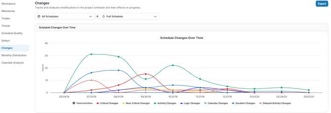
Drill into the Schedule Changes Over Time:
- The Schedule Changes Over Time graph lists the count of changes per update by category:
- Total Activities: Total number of activities within the selected schedule date
- Critical Changes: Changes applied to activities that are on the project’s critical path or directly influence the project/milestone completion date.
- Near Critical Changes: Changes applied to activities that are not currently critical but have low float and could become critical if delayed further
- Activity Changes: Any addition, deletion, or modification to an activity’s core attributes
- Logic Changes: Modifications to the relationships between activities
- Calendar Changes: Switching the work calendar assigned to an activity.
- Duration Changes: Adjustments to the total planned working days for an activity.
- Delayed Activity Changes: Changes where an activity’s planned start or finish date moves later than previously scheduled.
- Clicking any change type will remove that change type from the graph.
Scroll down to view the information in table format. To learn more about a specific change, click its corresponding number. A detailed table will then appear, showing all the selected specific changes made in that update.
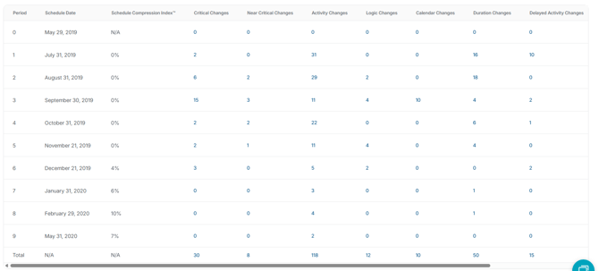
SmartPM only tracks changes on the plan side (incomplete activities). Changes to completed items will not be included. Changes are relative to the prior schedule update, not cumulative from the baseline.
Flagging Changes in SmartPM
Flagging changes allows you to highlight significant updates in your project schedule for future discussion or analysis. To flag changes:
- Locate the row with the scheduled date associated with the change you want to flag, then select the appropriate change type from the table.
- Click the Flag icon next to the changes you would like to flag.
- Flagged changes will be accessible in the Flagged Changes column for that schedule date.
Explore and Use the Data:
- Click the blue Export button on the top right to download an Excel file.
- The file will include a summary and separate tabs for each change category.
- Use your Excel tools, such as sort, filter, and pivot tables, to dig deeper into the data.
Actions Based on Insights
- Identify rebaseline opportunities: A large number of changes between updates often indicates a “new” schedule. Rebaseline so all statistics reflect the current plan.
- Diagnose future acceleration: If the plan side shows acceleration to recover from a delay, use the change log to see what activities or logic were adjusted to bring the end date back in line.
- Understand compression: Acceleration often results in compression. Review the change log to see which activities were modified and where compression was built into the plan.
- Flag key changes for review: Highlight the most impactful changes for stakeholder discussions, deeper analysis, or as part of a change condition in SmartPM.
Monthly Distribution Tab
The Monthly Distribution Chart in SmartPM visually represents when activities are scheduled to start and finish, comparing baseline vs. actual vs. current planned timelines. This tool helps identify scheduling trends, potential compression, and areas requiring attention. You are also able to apply filters for the monthly distribution chart by clicking the filter button from the top left.
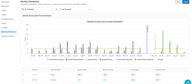
The Monthly Distribution Chart includes:
- Baseline Start/Finish: The original planned dates for activity starts and finishes.
- Current Start/Finish: The actual dates when activities started and finished.
- Planned Start/Finish: The projected dates for activity starts and finishes, based on the most recent schedule update.
These components are displayed as bars within the chart, allowing for a visual comparison across different time periods. They are also displayed on a table below the chart.
Should Start/Should Finish
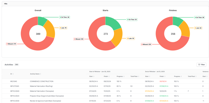
The Should Start / Should Finish tab analyzes planned versus actual start and finish dates for any update, showing whether activities within a selected window hit their dates on time, finished late, or missed the window entirely. Results are broken out into three views: Overall, Starts, and Finishes, each displaying On Time, Late, and Missed counts so you can quickly gauge how well the schedule is tracking to plan.
The activities table below the charts lists every activity in the window with start-of-window and end-of-window comparisons across Start, Finish, Progress, and Total Float, along with variance. You can narrow the view by schedule, adjust the analysis window, group results, or apply filters using the controls at the top of the page.
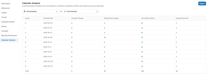
Calendar Analysis Tab
The Calendar Analysis in SmartPM tracks changes to your project's calendars, providing transparency and aiding in schedule analysis.
What the Calendar Audit Log Tracks
- Calendar Changes: Records additions and deletions of calendars
- Working Day Changes: Logs when a day is switched between working and nonworking status, and when work hours for a day are altered.
- Hours/Day Conflicts: Identifies discrepancies where a day's work hours do not align with the calendar's default time period settings.
- Extended Days Off: Highlights instances of seven or more consecutive nonworking days.
Understanding Work Hours Settings
SmartPM recognizes three primary types of work hours settings in a calendar:
- Time Period: Defines default work hours for each day, week, month, and year of an activity's duration. For example, setting 8 hours per day means a four-day activity totals 32 hours.
- Weekly Hours: Specifies default work hours for each day of the week. This allows for adjustments, such as including 4 work hours on Saturdays in a standard 5-day, 8-hour workday calendar.
- Daily Hours: Allows modifications to the work hours for individual days within the weekly schedule. For instance, changing a single Monday to 12 work hours while the rest remain 8 hours or setting holidays as non-working days entirely.
Alterations to any of these settings are captured in the Calendar Audit Log, providing a detailed history of changes for review and analysis.