Schedule Compression refers to the amount of effort required to complete the remaining work on a project compared to the same amount of final work remaining in the baseline schedule. It quantifies how much the schedule has been accelerated and/or how much float has been eroded, and indicates the likelihood of meeting the planned end date.
SmartPM Categorizes compression risk using this color coding:
- Green (0-14%): Compression is within an acceptable range
- Yellow (15-24%): The project is still feasible but may require extra time, increased pacing, or labor to complete on time
- Red (25% +): The project end date is at risk due to the extra time and work required.
Example:
Most schedules are built on a five day calendar working Monday through Friday. Each day of the week is about 20% of the work week. When the schedule is compressed by 20%, it will be necessary to start working Saturdays to finish on time. Once your schedule becomes compressed by 40%, it will be necessary to work Saturdays and Sundays to finish the project on time. In a scenario where you don't have access to overtime, or additional manpower, your project will be delayed.
Causes of Compression:
Compression can result from various factors, including:
- Acceleration Due to Changes to Remaining Work: Decreasing the remaining duration of an activity or stacking trades means you need to complete more work in a shorter period of time.
- Slower- than-Planned Progress on Non-Critical Activities: If progress is not occurring as planned and float erodes, a non-critical activity can become critical, leading to schedule compression.
Monitor Schedule Compression in SmartPM:
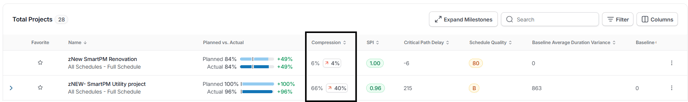
Schedule Compression on Project List:
- Compression can be added as a column on the Project List for quick access.
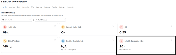
Project Summary:
- Click a project from the Project List
- Schedule Compression Index metric can be found in the Overview tab.
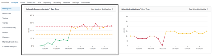
Schedule Compression Index Over Time:
- Click a project from the Project List
- Click Analysis from the top menu bar
- Within the Workspace you are able to access the Schedule Compression Index Over Time.
- This graph illustrates how compression has evolved over time and can be correlated with schedule changes and delays.
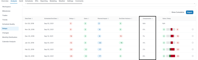
Schedule Update Compression Values in the Delay Table:
- From the Project List, click the project name
- Click Analysis from the top menu bar
- Click Delays from the left hand navigation.
The table below the graph will display a Compression column detailing the percentage of compression for the listed data date.
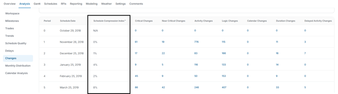
Schedule Update Compression Values in the Changes Table:
- From the Project List, click the project name
- Click Analysis from the top menu bar
- Click Changes from the left hand navigation.
The table below the graph will display a Schedule Compression Index column detailing the percentage of compression for the listed data date.
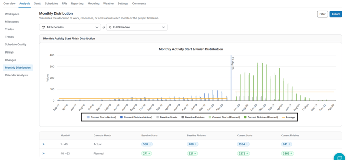
Monthly Distribution Table:
- From the Project List, click the project name
- Click Analysis from the top menu bar
- Click Monthly Distribution from the left hand navigation.
The chart compares baseline and current start/finish dates, showing whether future work exceeds the original plan. For example, if the schedule is 10% compressed, the chart will show more current activities than baseline in certain calendar months.